How do you turn a trusted non-profit organization into a modern, mission-driven brand?
Action
For nearly three decades, The Corporate Source has been a leader in providing meaningful employment and support to people with disabilities. Their name, story, and identity however, didn’t capture the power of their mission. With a leadership team looking for change, the non-profit partnered with co: to undergo a holistic brand transformation.
We began by shifting their narrative away from familiar charity tropes and into a territory of operational excellence, all while celebrating their diverse team. Instead of just a workforce, we repositioned their staff as a force for more.
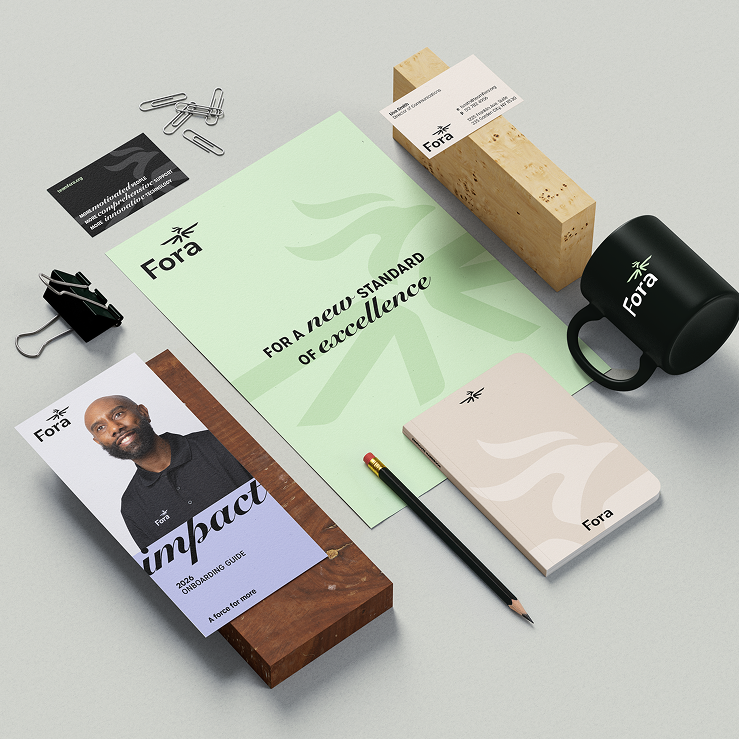
With the story in place, a bold new name emerged: Fora. Evoking ancient public gathering places and forums, Fora signals community, belonging, and collective strength. From there, we built a comprehensive messaging and identity system that elevates how both the brand and people with disabilities are perceived.
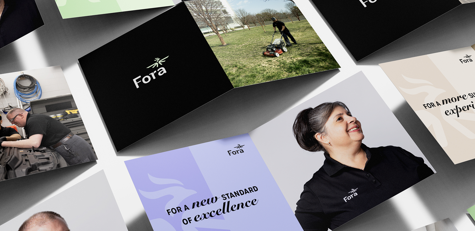
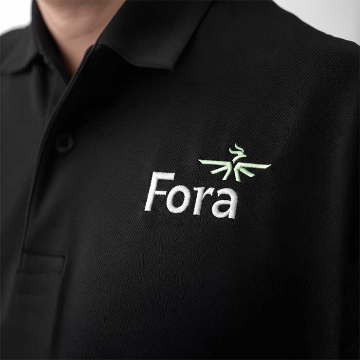
A key part of the identity included a new logo mark: The Fora Phoenix. This heroic supergraphic conveys the power of rising above perceptions. Paired alongside a high-contrast, sensory-friendly color palette, and refreshed portraiture photography, the new system captured the pride of real employees and blended deep utility with an elevated professionalism. In the end, their new brand proves that Fora doesn’t just show up—but ups the bar.
Naming
Visual Identity
Brand Strategy
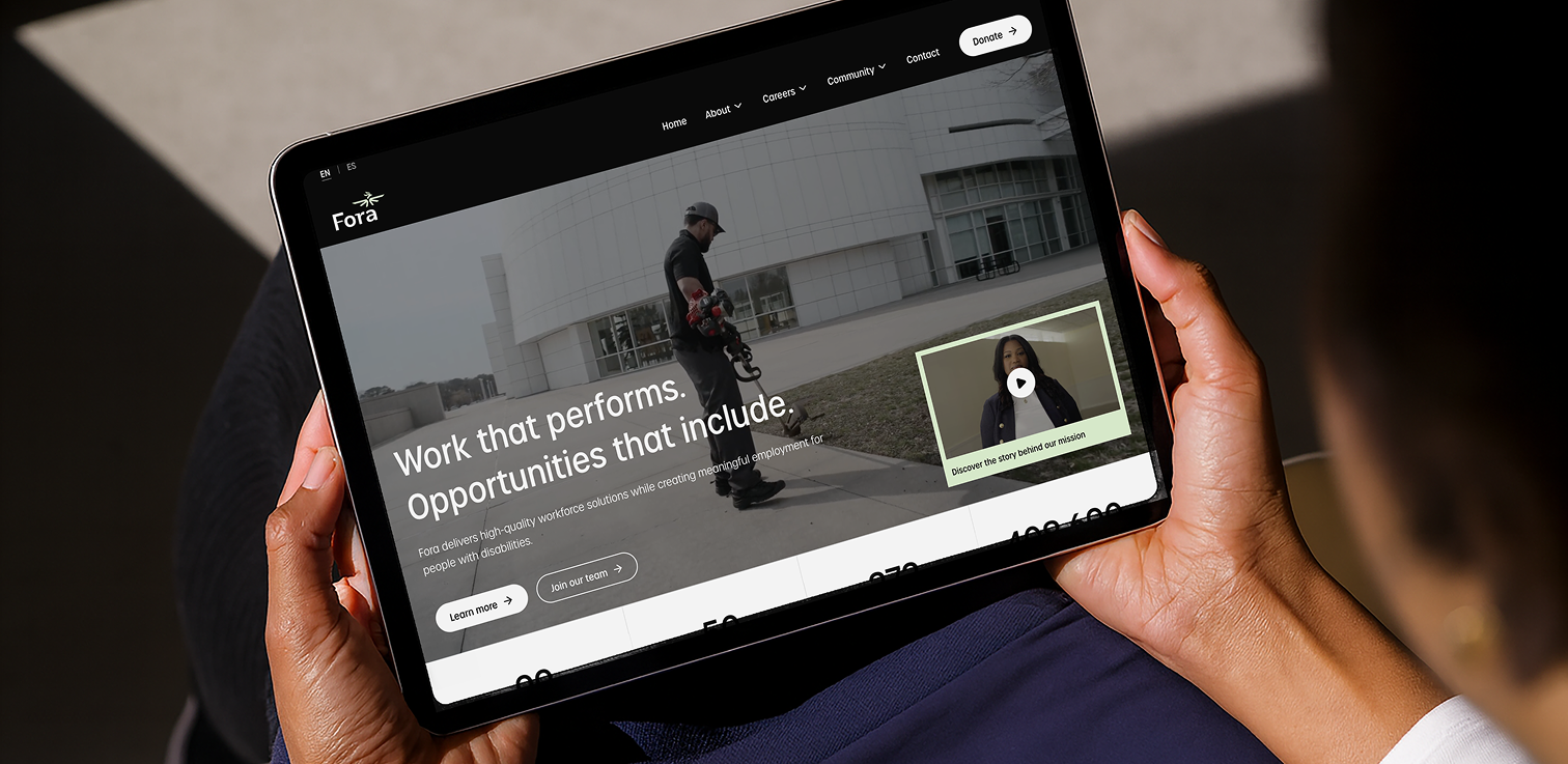
Website
Brand Portal
Story Platform
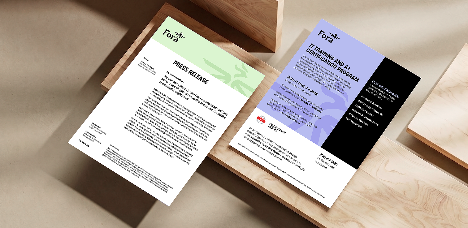
Messaging
A force for more
The Fora rebrand is a bold new example of how to elevate a non-profit brand into a sophisticated enterprise presence – without losing its soul. The new name, strategy, and identity system work in seamless harmony to anchor the brand in meaning, giving this legacy organization the modern toolkit it deserves.
A new name to signal change
The plural of “forum,” the new name evokes the public gathering places of the ancient world. It signals community, collaboration, and belonging with a quiet confidence, instantly modernizing the organization’s corporate perception
The origin of our mark
The new logo mark is a dual-metaphor: The Fora Phoenix. It blends two core concepts into one powerful visual statement.
The Sunrise: The upward trajectory and radiating energy represent the dawn of a new day, symbolizing infinite possibilities.
The Phoenix: Represents resilience, specifically the strength to overcome adversity and defy expectations.